The brief
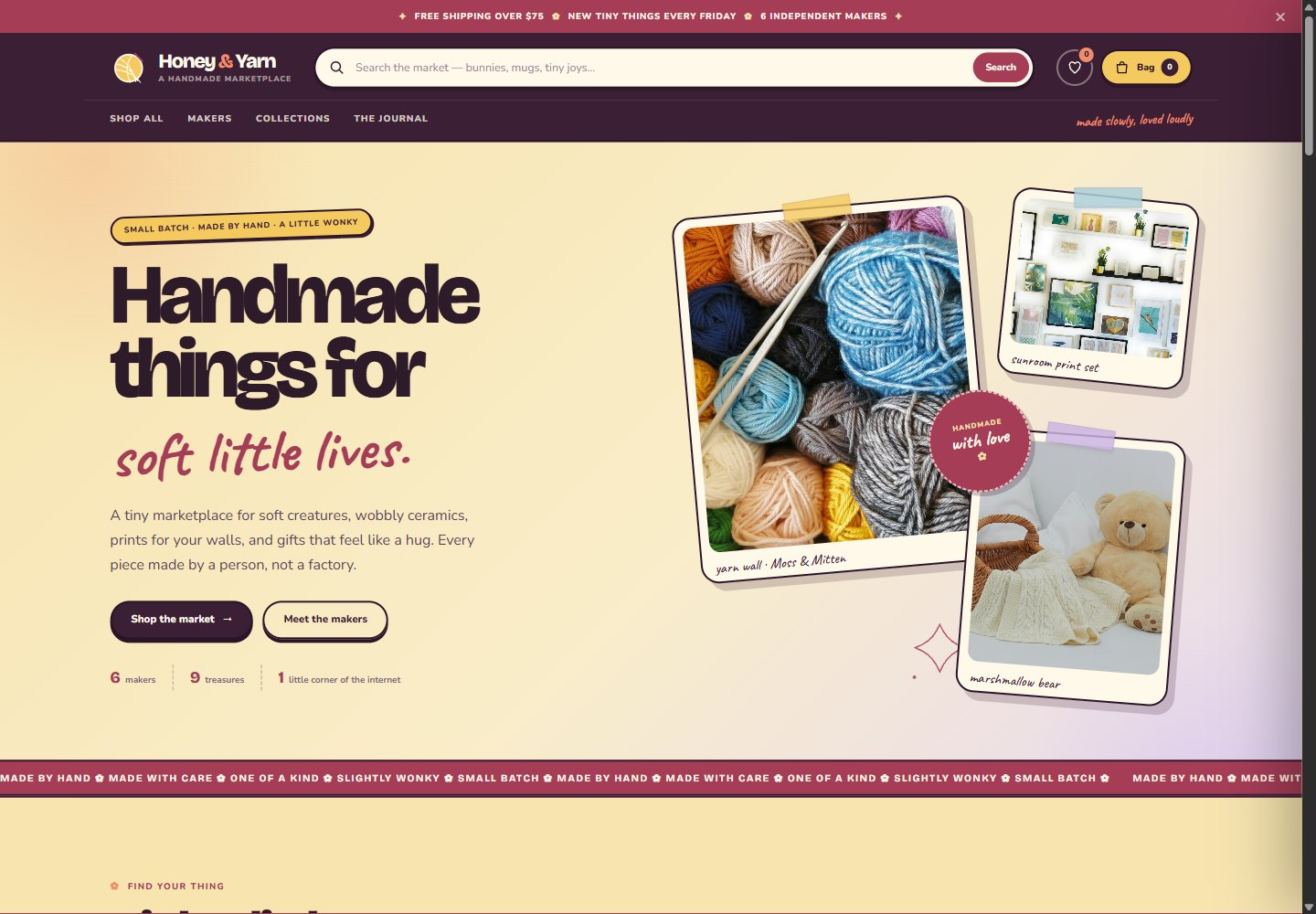
Honey & Yarn is a fictional handmade marketplace with a big personality and a very small team of makers. The brief was to make browsing feel like wandering a craft fair: warm, a little chaotic, full of colour, and never corporate.
It had to work like a real shop, too. Search that finds things, categories that make sense, favourites for the “maybe” pile, a quick view that doesn't lose your place, and a bag that feels like the obvious next step.
The build
The design system is deliberately not another cream-and-sage site: butter yellow, deep plum, peach, lilac and sky, with Bricolage Grotesque for the shouty bits, Nunito for the useful bits, and Caveat for the handwritten notes. Gingham, dotted borders, sticker badges and slightly rotated cards carry the handmade feel.
- Marketplace UX — nine products across six categories and six makers, with live search, category filters, price/newest sorting and a result count that updates as you type.
- Favourites — hearts on every card and in quick view, persisted in localStorage, with a saved-things dialog and its own count in the header.
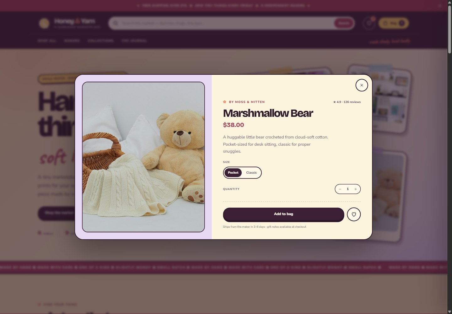
- Quick view + cart — product dialog with maker, rating, description, size/colour/scent options, quantity, add-to-bag, and a bag drawer with quantity controls and subtotal.
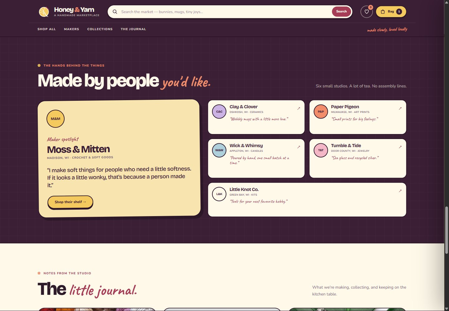
- Maker storytelling — a featured maker with a quote, five more maker cards that filter the shop by maker, and a journal with three readable notes.
- Responsive & accessible — two-column mobile product grid, keyboard-friendly dialogs, aria-pressed hearts, aria-live filter status, focus styles and reduced-motion support.
What's real vs. demo
Real in this prototype
- Search, category filters, sorting and result status
- Favourites with localStorage and saved-things dialog
- Product quick view with options, quantity and add-to-bag
- Cart drawer with quantities, removals and subtotal
- Journal dialogs, maker filters, mobile layout
Mocked / not connected
- Checkout, payments, accounts and order history
- Inventory, shipping rates, taxes and maker payouts
- Real reviews, ratings, makers and products
- Email capture and newsletter delivery
- Photography is demo imagery
Production path
A real marketplace would sit on Shopify, a headless commerce stack, or a custom multi-vendor platform. The front end here is the design contract: cards, filters, favorites, quick view, cart and vendor storytelling would connect to that commerce layer.
The design system
Palette
Butter
Plum
Berry
Peach
Lilac
Sky
Warm, saturated and deliberately un-minimal. The palette does the emotional work; the layout keeps the shopping clear.
Type
Handmade things for soft little lives.
Bricolage Grotesque for display · Nunito for body and controls · Caveat for the handwritten asides.
Marketplace UX
Search & filters
Sorting
Favourites
Quick view
Cart drawer
localStorage
Maker profiles
Journal dialogs
Responsive
Reduced motion
No framework