The brief
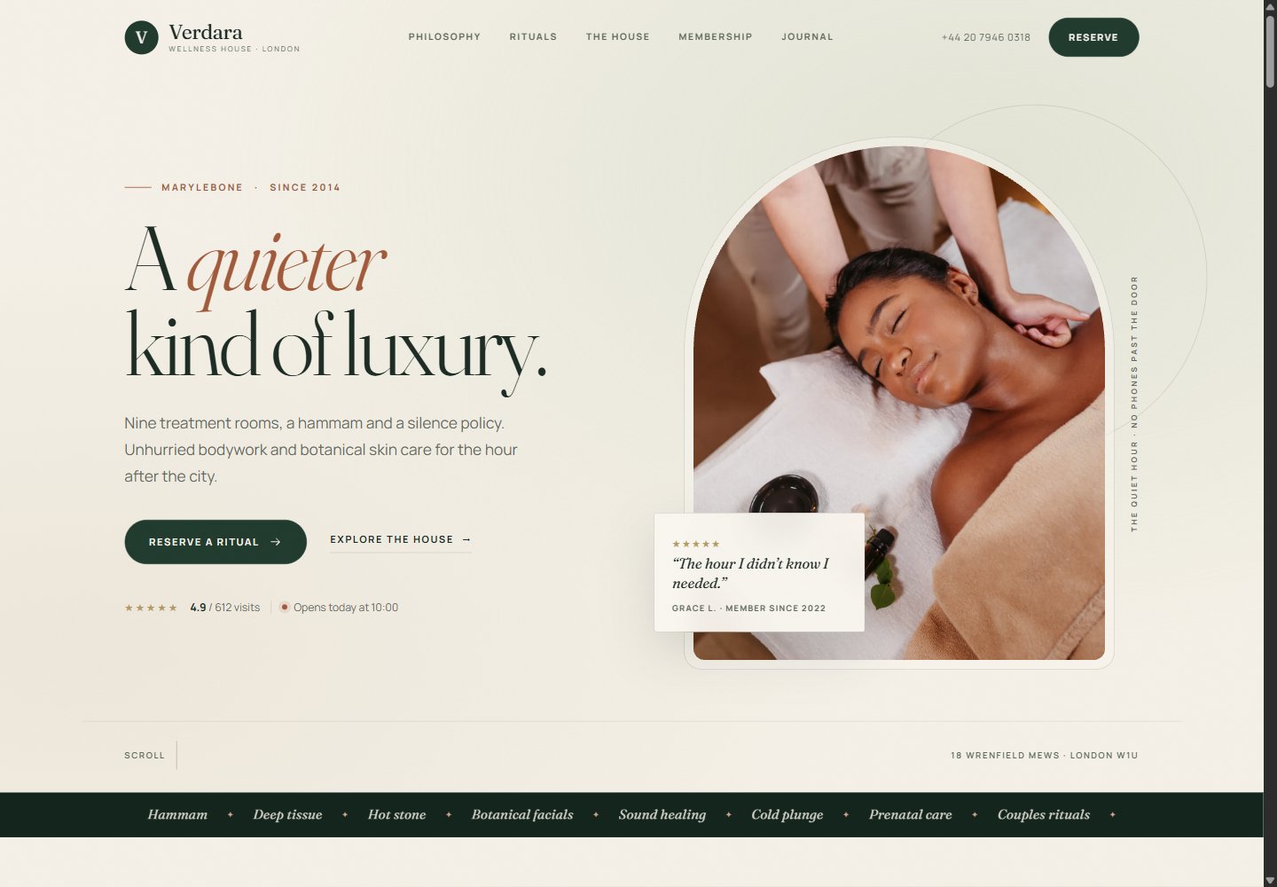
Verdara is a fictional private wellness house in Marylebone: nine treatment rooms, a hammam and a silence policy. The brief was to design a site that feels like walking through the door — quiet, tactile, unhurried — and then make booking feel like the obvious next step, not a checkout.
It needed to sell six rituals across bodywork, skin and longer journeys; explain three membership tiers; introduce a team; hold a journal; and do it all without the hard edges of a typical spa template.
The build
The visual system is cream, forest green and clay, with Fraunces for the voice and Manrope for the work. An arched hero photograph, a fine grain texture and generous spacing carry the “quieter luxury” idea before a single line of copy lands.
- Ritual menu — six treatments across three categories, filterable with an aria-live status message; every card carries duration, price and a reserve action that feeds the booking form.
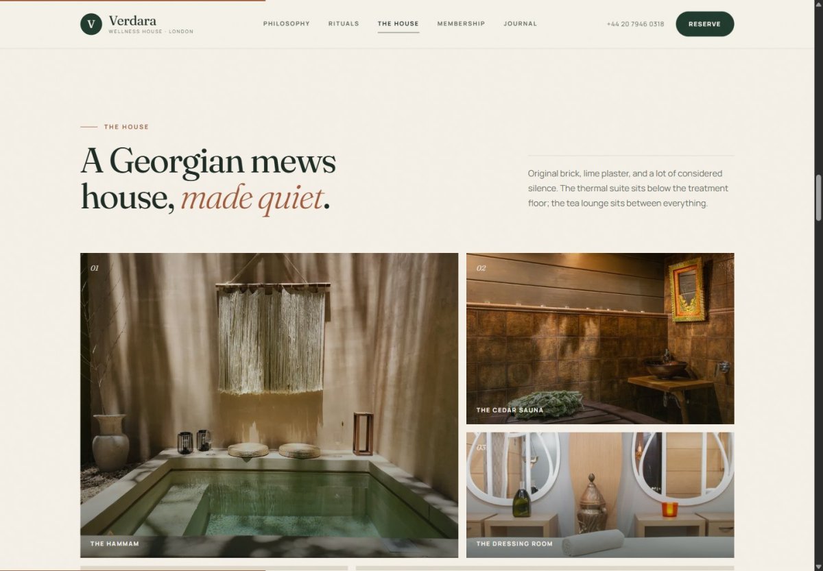
- House & story — an asymmetric image grid with a keyboard-accessible lightbox, team portraits, a testimonial carousel and journal articles that open in dialogs.
- Membership — three tiers with a featured plan and CTAs that prefill the booking enquiry.
- Booking flow — ritual, day and time chips, validated contact fields, a live summary and a success state. The front end does the work; no backend is connected.
- Accessibility & performance — native dialogs with focus management, aria-live updates, keyboard paths, reduced-motion support, local fonts and lazy-loaded imagery.
What's real vs. demo
Real in this build
- Responsive one-page layout and mobile menu
- Ritual filters, journal dialogs, lightbox, testimonial carousel and FAQ accordion
- Booking validation, date/time selection, live summary and success state
- Focus handling, aria-live status and keyboard navigation
Mocked / not connected
- Reservation requests — no backend or email delivery
- Team, testimonials and membership plan data are fictional
- No real appointments, payments or member accounts
- Photography is Pexels demo imagery
What a production handoff would add
A real booking backend or scheduling integration, transactional email, CRM capture, calendar availability, deposit/payment flow if required, and staff-facing confirmation. The site is a complete front-end contract for that work.
The design system
Palette
Cream
Forest
Clay
Sage
Gold
Earthy, low-contrast and warm. The palette stays quiet; the photography and the spacing do the luxury work.
Type
A quieter
kind of luxury.
Fraunces for display · Manrope for body, labels and controls.
HTML5
CSS custom properties
Vanilla JS
Native dialogs
Booking validation
Filterable menu
Journal dialogs
Lightbox
Local WOFF2
Lazy images
Reduced motion
Responsive