The brief
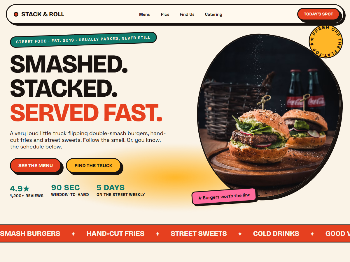
Stack & Roll is a fictional street kitchen built to show what a brand with real personality can do online. The brief: make the site as loud as the food — but keep it loading instantly for someone standing in line with one thumb and ninety seconds of patience.
Neo-brutalism was the right system: it takes confidence, it photographs well, and it is almost free to build — borders, hard shadows and flat color instead of gradient-heavy hero blobs.
The build
The palette is lifted from the truck wrap itself: cream paper, ink outlines, tomato for appetite, mustard for energy — with teal and pink as supporting players. Everything gets a hard 8px offset shadow instead of soft blur, and nothing is perfectly straight.
- Filterable menu — eight dishes across burgers, sides, greens and sweets; one-tap filter buttons, rotated mustard price stickers and personality taglines ("Shareable — nobody shares").
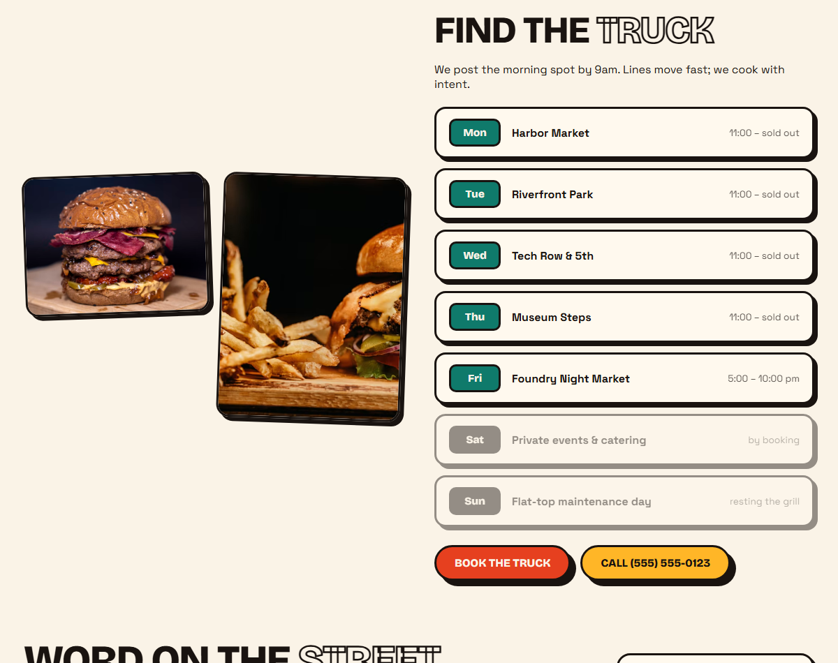
- Live route schedule — a seven-day "find the truck" table with today's spot styled distinctly, off-days dimmed, and a tap-to-call button to the window.
- Photo wall gallery — a masonry grid on ink black that opens a native <dialog> lightbox: no libraries, keyboard dismissible, backdrop-blurred, lazy-loaded.
- Marquee tickers — two full-width CSS-only bands (tomato and teal, opposite directions) scrolling menu highlights and the schedule; they respect prefers-reduced-motion.
- Catering funnel — a mustard CTA band ("Party? We'll roll up.") feeding a mailto quote flow — zero backend for the owner to maintain.
- Testimonials with tilt — three five-star quotes rotated like taped diner reviews with colored initial chips; they straighten automatically on mobile.
- Sub-second loads — one HTML file, two font families, no frameworks, GPU-friendly transforms only.
What's real vs. demo
Real in this build
- Responsive one-page layout with sticky pill nav
- Menu filters, route schedule states, marquee tickers
- Masonry gallery with native dialog lightbox
- Reduced-motion support and lazy-loaded imagery
Mocked / not connected
- Catering requests — mailto demo, no backend
- Reviews, route stops and pricing are fictional
- Phone number and email are placeholders
- Food photography is Unsplash demo imagery
What a production handoff would add
A real route feed (the owner posts the morning spot in one place), ordering or delivery integration if wanted, transactional email for catering quotes, and the client's own photography. The one-pager is the complete design contract for that work.
The design system
Palette
Cream
Ink
Tomato
Mustard
Teal
Appetite colors with ink outlines. The shadows are hard on purpose — softness would soften the food.
Type
Smashed. Stacked.
Served fast.
Fraunces for display · Inter for body · JetBrains Mono for labels and prices.
HTML5
CSS custom properties
Vanilla JS (~60 lines)
Native <dialog> lightbox
CSS marquee keyframes
IntersectionObserver
Menu filters
Lazy images
Reduced motion
One page · 28KB